![]() |
| Giants Causeway, Northern Ireland 2008 |
Showing posts with label Northern Ireland. Show all posts
Thursday, January 26, 2012
Thursday, January 5, 2012
Thursday, October 13, 2011
Everyone's a critic!
A bit of an unexpected post today, I was hoping to mention a couple of up and coming exhibitions taking place in London on the theme of maps but instead my I find myself writing about my own exhibition which has just been bombed. Yes you read correctly bombed! Now I know everyone one has the right to criticism but this is a touch too much!
I am of course making light of the situation and am being a little melodramatic and a little untrue, it wasn't my work that was the focus of such ire and anger but the building where my work was being exhibited in Derry, the Culture Offices based just off the Guildhall Square.
As you may or may not be aware Derry/Londonderry was awarded UK city of Culture 2013 last year, a great achievement, that in my eyes gives not only the North West a chance to show itself in an new light (that has nothing to do with sectarian violence) but the whole of Northern Ireland. However some factions of the political spectrum take exception to the letters 'UK' and what they represent. They then vent this dissatisfaction by placing bombs in the doorway of the Culture Offices. Now I'm not a politician and this isn't a political blog but speaking as someone from the area I can only see the accolade of City of Culture 2013 (be it UK or Irish, European or even Galactic!!) as a positive thing bringing renewed infrastructure, jobs, investment and tourism to the region. Believe it or not people still equate Northern Ireland with the troubles and violence and would rather visit the south of Ireland than the North, it's time to show them that it is about so much more than violence and what better way than giving them a good time and the putting on display the rich cultural heritage we have not only in Derry but in the North as as a whole. Everyone has the right to protest but not just by leaving bombs in the street.
Here are a few gems from Derry's rich cultural tapestry, taking in the Undertones, Our Krypton Son, Famous Seamus and a bit of Danna as well…
I was only joking about Danna!
Tuesday, October 4, 2011
Collection box
I came across this charity collection box when I was in Derry last month. I hadn't seen a collection box like this since the early eighties! I remember the boy with a caliper outside the chemist and the blind boy reading braille perched outside the charity shop but now most of these have disappeared as they were outdated and not very PC, but unfortunately they have been replaced by generic perspex boxes or a group of people in day-glo tabbards requesting you to set up a direct debit.
When I saw the kitten box I was a bit thrown by the relationship between the kittens and Romanian Orphans but after a while I realised it was probably originally used for the R.S.P.C.A. (the Royal Society for the Prevention of Cruelty to Animals) and had been adapted to help raise money for Romanian orphans.
Thursday, September 22, 2011
Culture Night
Tonight is Culture Night across Ireland. As I mentioned before I am taking part in the celebrations in Derry by showing some work in the Culture Offices just beside the Guildhall.
I have created a new papercut based on the tale of a local Derry legend called Half Hung MacNaughton.
The story goes that MacNaughton was a down at heel part of the Irish gentry, who claimed to have fallen in love with a young heiress, Mary Ann Knox from Derry. However, her father did not give consent to their marriage. In November 1761, an attempt by MacNaghten and his followers to abduct Mary Ann from a carriage on a journey to Strabane and elope with her failed, when he shot and mortally wounded her by mistake. A court found MacNaghton guilty of murder and he was sentenced to execution by hanging. So distraught with grief was he by the death of his love that MacNaghton is alleged to have hurled himself from the gallows with such force that the rope broke. Some versions say that this was divine intervention and MacNaghton could not be hanged for a second time; others say that he could have used the cover of a sympathetic crowd to make good his escape but he chose not to. Instead John MacNaghton freely re-ascended the gallows to be hanged successfully.
This is the first in a series of paper cuts that I am planning to do on this subject.
So if your in Ireland go enjoy the nearest event to you and if you in and around Derry then please pop in to the Culture Offices and say hello!
Friday, September 16, 2011
Friday, August 12, 2011
Friday, August 5, 2011
Thursday, July 28, 2011
Uncle Sam
I was up in Derry the other day having my first look at the new Peace Bridge, well worth a visit! The weather was a little over cast and wet but seeing this ice cream van made me smile! I have lots of happy memories of seeing this van on Benone Beach and sampling it's wares.
Blog Break
Apologies for the lack of regular posts around here lately but this has been down to some unseasonal sunshine in the north of Ireland which means I have been out on the beaches and in the forests making the most of it while it lasts!
Friday, July 22, 2011
Friday, July 1, 2011
Tuesday, June 28, 2011
The Earl Bishop
When I was back home at Easter I picked up a copy of Stephen Price's book The Earl Bishop. The book is a biography of Bishop Hervey, the man who built the famous Mussenden Temple, one of the worlds most famous follies. As I'm from that neck of the woods it was nice to finally come across a book that told the story of the place and of the man who made it.
As a bit of a design challenge I decide to re-design the cover. I didn't have a design brief but as a rule I used all the elements that were on the existing cover and a turn around time of one day. The original cover looks like this, an uncharacteristic sunny day with a blue sky showing off the famous follie with a pillared wall echoing the monuments classic architecture which acts as a holding area for the books title and the authors name.
I started by researching architectural decoration of the period and mixed this research with the Antiqua series of classic texts. These are a real design treat and totally of their time. They were produced from the early 1900's in France and feature a refined yet restricted colour palette and a tidy visual framing which draws inspiration from classical Greek architecture.
The next step was to incorporate some of the actual architecture from Mussenden and start to work these into the cover. One of the most famous parts of the site where the Bishop's stately home once stood is the Lion's Gate,(even though the two stone cat sculptures which the gate takes its name from are actually Ocelots). I drew a number of stylised sketches of the sculptures and continued to carry out a pencil sketch taken from a photo of the Temple itself. I inked these out, scanned them in and then played about with them in Illustrator, where I started creating the frame.
Like the Antiqua series I decided to stay with a two colour scheme. I chose blue and green simply because of the geography of the area and the relationship between the land and the sea. In case you have never been the Temple is right on the edge of a cliff looking out over sea, in fact the inscription that circles the temple it's self reads "Suave mari magno, turbantibus aequora ventis, E terra magnum alterius spectare laborem" which translates roughly as "Tis pleasant, safely to behold from shore, The rolling ship, and hear the tempest roar." and probably not "Agreeable husband very turbantibus the waters to toss in the air, out of earth large the second specter to sink" which I got the first time I fed the quote through an online Latin translator!
For the text I used Gill sans in caps for the titles and Perpetua Regular for the quotes and book blurb. I liked the balance between these two typefaces, the geometry of Gill sat well with the frame work while Perpetua Regular gave a classic book feel. One of the only deviations I made from my original brief was that I didn't use an actual portrait of the Bishop instead to fit with the graphic nature of the frame I decide to use a silhouette of the Bishop. The silhouette originated in the 18th century, so it felt apt that it could be included. While I was researching this I found out an interesting little fact about where the word silhouette comes from, if your interested click here!
Anyway the final cover back and front turned out like this:
It's by no means a final finished piece of design more a play around with genres, type and applying these to the elements of a pre-existing design. If any thing it has also been a bit of light design relief and fun to boot!
Friday, May 27, 2011
Wednesday, April 27, 2011
Fool's Gold
Apologies for the silence I'm just back again from a couple of weeks in the North of Ireland and spent my time shared between working and taking family friends on the tourist route. This involved crossing the Carrick-a-reed rope bridge, walking around Mussenden Temple at Downhill, walking the city walls up around Derry as well as going back to The Giant's Causeway.
It was while visiting the Giant's causeway and sitting down on the stones and watching the black blue waves rolling in over the stones that I was reminded of all things the album cover for the The Stone Roses debut album ( forgive me, I know the last time I was back it was Led Zep's Houses of the Holy!)
History has it that while doing a gig at Coleraine University The band took a trip up to see the Causeway. Guitarist John Squire was so struck by the colour of the water and rocks that he kept them in mind for a painting that was later used as the cover image for their debut album. The painting was called "Bye, Bye Badman" and is essentially the Causeway inspired image with lemon slices. The lemon slices were added to the composition later based on a story that Ian Brown had heard from a Parisian about how during the 1968 riots; protesters at the time used lemons as an antidote to the tear gas.
At the time that album was such a revelation! I remember taking my copy to friends houses and sitting in amazement, it affected the way that I dressed, and proved a fantastic introduction to the art of Jackson Pollock, (in fact for about 12 months very little escaped being paint splashed from clothes to instruments).
What I loved as well about the covers and releases was that they were all printed on a really tactile card and contained a postcard or print of the sleeve art work which was a simple nice touch that just made you want to collect them all! A deluxe 20 year anniversary edition was released last year with reproductions of the sleeves, a book, heavy quality vinyl and 4 CDs, a bit over kill I think, but hey it is a classic album!
And now for no other reason than nostalgia here are a few more of the classic single covers, which have a strong yet restrained design allowing John Squire's artwork to be the focus but that never left you in any doubt that it was a Stone Roses release!
It was while visiting the Giant's causeway and sitting down on the stones and watching the black blue waves rolling in over the stones that I was reminded of all things the album cover for the The Stone Roses debut album ( forgive me, I know the last time I was back it was Led Zep's Houses of the Holy!)
History has it that while doing a gig at Coleraine University The band took a trip up to see the Causeway. Guitarist John Squire was so struck by the colour of the water and rocks that he kept them in mind for a painting that was later used as the cover image for their debut album. The painting was called "Bye, Bye Badman" and is essentially the Causeway inspired image with lemon slices. The lemon slices were added to the composition later based on a story that Ian Brown had heard from a Parisian about how during the 1968 riots; protesters at the time used lemons as an antidote to the tear gas.
At the time that album was such a revelation! I remember taking my copy to friends houses and sitting in amazement, it affected the way that I dressed, and proved a fantastic introduction to the art of Jackson Pollock, (in fact for about 12 months very little escaped being paint splashed from clothes to instruments).
![]() |
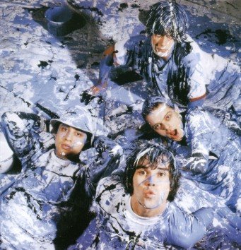
| Things didn't get quite this bad but they came close! |
And now for no other reason than nostalgia here are a few more of the classic single covers, which have a strong yet restrained design allowing John Squire's artwork to be the focus but that never left you in any doubt that it was a Stone Roses release!
Friday, March 18, 2011
Friday, March 4, 2011
Thursday, February 24, 2011
Thursday, February 17, 2011
Friday, January 21, 2011
Subscribe to:
Posts (Atom)


